Check it out!!! New Header! Proper Menu! Signature!
I’m super happy with the new look. When I first picked this theme it was out of desperation since it appeared that I messed up the other theme I had in fumbling through making it more mine. I then had this moment of panic thinking I wasn’t able to create a custom header in. So I started looking for other themes that I could have a custom header and then discovered I was just looking in the wrong place for the information. Amazing what you miss when your rushing because your 1 year old is going to wake up any minute.
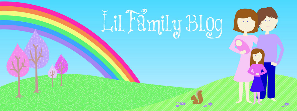
So, The new header reflects the dots which I haven’t figured out how to take out. But I dig them anyways, so I figured lets go with it. Oh, and as I think about it. I’ve figured out that if I made the background image and didn’t repeat it I could put in something other then dots. I think. Hmmm….. might have to play with that one another night. So the dots and colours are a reflection of what I had to work with. The font for ‘Wide Asleep Mom’ is called Return to Sender. I fell in love with this on Pinterest. (ya ya… it has its moments of brilliance without making you feel like a failure) It felt fun and kinda whimsical, just made me happy in a pastel colour. But it looks pretty rockin in black too. I tried both ways and im 99% sure the pink is better then black. You be the judge.


The font for ‘Who needs sleep anyways?’ is called Pea Noodle Parlor. I knew for the tag line I really wanted a handwritten look. It feels like these work together nicely and reflect my personality well, a little tough and a little sweet and funky. You’ll also notice I ditched a couple of the dots. The ones in the top right felt like they where off at some other party. So I uninvited them.
I had been thinking I’ve shared names of my family. But I don’t think I’ve shared MY name. I’m honestly not sure if its relevant, but since I’m sharing my personal thoughts and opinions, a name could be nice.

So I’ve made up a little signature that I am going to try out on a couple posts. So I’m using the same Pea Noodle Parlor font because constancy is important in creating a brand. Too many different fonts and you begin to lose your viewer. Then my blog friend was asking me for a button so she could share my blog. So I came up with this little guy. Again working with the same fonts and colours to keep the brand and theme consistent.

So, there you have it. Nothing crazy, but it works for what I need. And it kept me out of trouble on a Wednesday night. Ok…. It kept me from falling asleep at 730pm when putting Is to bed. Mark was great and took care of the girls so I could get a head start on some design stuff I’m working on. Soon I’ll share the birthday invitations I’m working on for my goddaughters 2nd birthday!